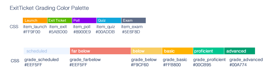
Branding strategy for the ExitTicket project consisted of creating a fresh, new palette of colors and styles that appeals to students from kindergarten age to a high school senior. We wanted to break away from the traditional 'bad school design' style that is incredibly prevalent in today's school apps. We chose a vivid orange as the base (creative, uplifting color) and chose a typestyle that felt 'familiar' to the Facebook & Twitter generations.
Logo treatments work well in multiple colors, sizing situations and busy environments.
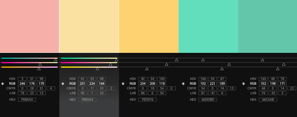
The second objective was to create a new palette for scoring, grading that was not your traditional standard stoplight red and green. Score bracketing also was heavily considered and designed specifically to be thoughtful and engaging without any harsh or demoralizing undertones. Since ExitTicket promotes and fosters students to experiment and think through questions without the pressures of a test, we wanted to ensure that the student felt always positive about their experience with color.